
Project overview.
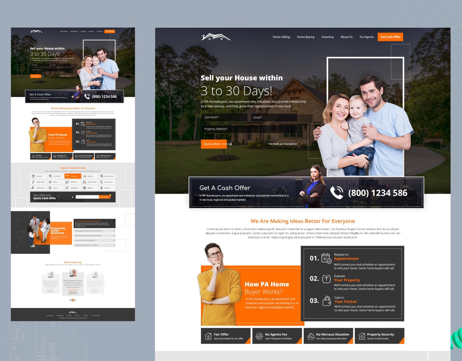
A conversion-focused landing page for PA Homebuyers, a company that buys houses directly from owners for cash. The page had to explain a fast, unfamiliar selling process, earn trust quickly and turn visitors into booked appointments and cash-offer requests.
| Project | Detail |
|---|---|
| Role | UI/UX Designer (end to end) |
| Client | PA Homebuyers |
| Services | UX Research, UI/UX Design, Web Design |
| Platform | Responsive marketing website / landing page |
| Tools | Figma |
| Published | November 2022 |
The problem.
Homeowners who want to sell fast are usually under pressure: a foreclosure, a costly repair, a divorce, an inherited house or simply a need for quick cash. They are wary of agents' fees, lowball offers and long, uncertain timelines, and most cash-buyer sites feel either pushy or untrustworthy.
How might we make selling a house for cash feel simple, safe and fair enough that an owner books an appointment on the first visit?
Goals and success criteria.
- Make the promise instant: "sell your house within 3 to 30 days" understood in a few seconds.
- Lower the effort to start: a short lead form and a phone number visible above the fold.
- Explain the process: show exactly what happens after someone gets in touch.
- Build trust: real faces, clear benefits, answers to common doubts and social proof.
- Keep the call to action close: a cash-offer prompt at every natural decision point.
Who we designed for.
Owners who need to sell quickly and on their own terms, often in a stressful situation. They want certainty more than the highest possible price, are not interested in staging or long listings, and need reassurance that the buyer is fair and legitimate. Many arrive on mobile, so every step had to work on a small screen.
Design approach.
I treated the page as a guided conversation: state the offer, remove the effort, explain the steps, answer the doubts, then ask again. Each section answers the next question a hesitant seller is likely to have, and each ends close to a way to act.
Information architecture and flow.
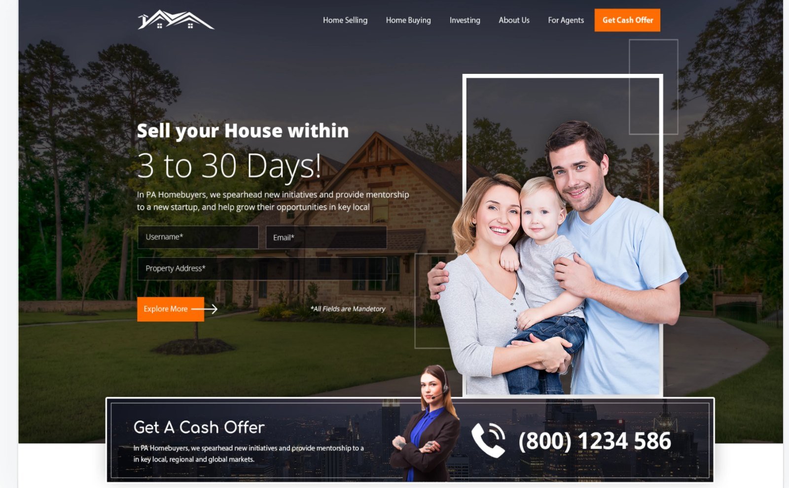
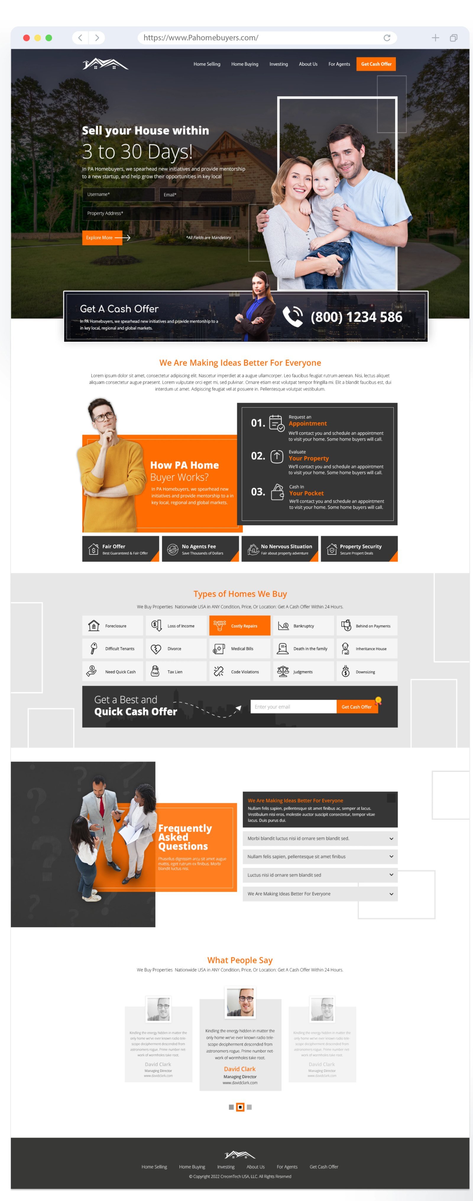
- Hero: the 3 to 30 day promise, a three-field lead form and a "Get a Cash Offer" bar with the phone number.
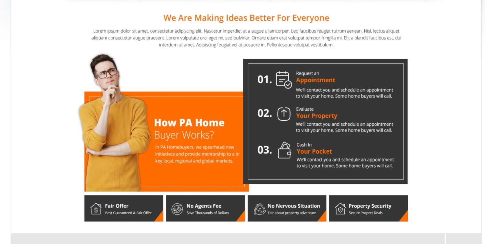
- How it works: three steps: request an appointment, evaluate your property, cash in your pocket.
- Benefits: fair offer, no agent fees, no nervous situation, property security.
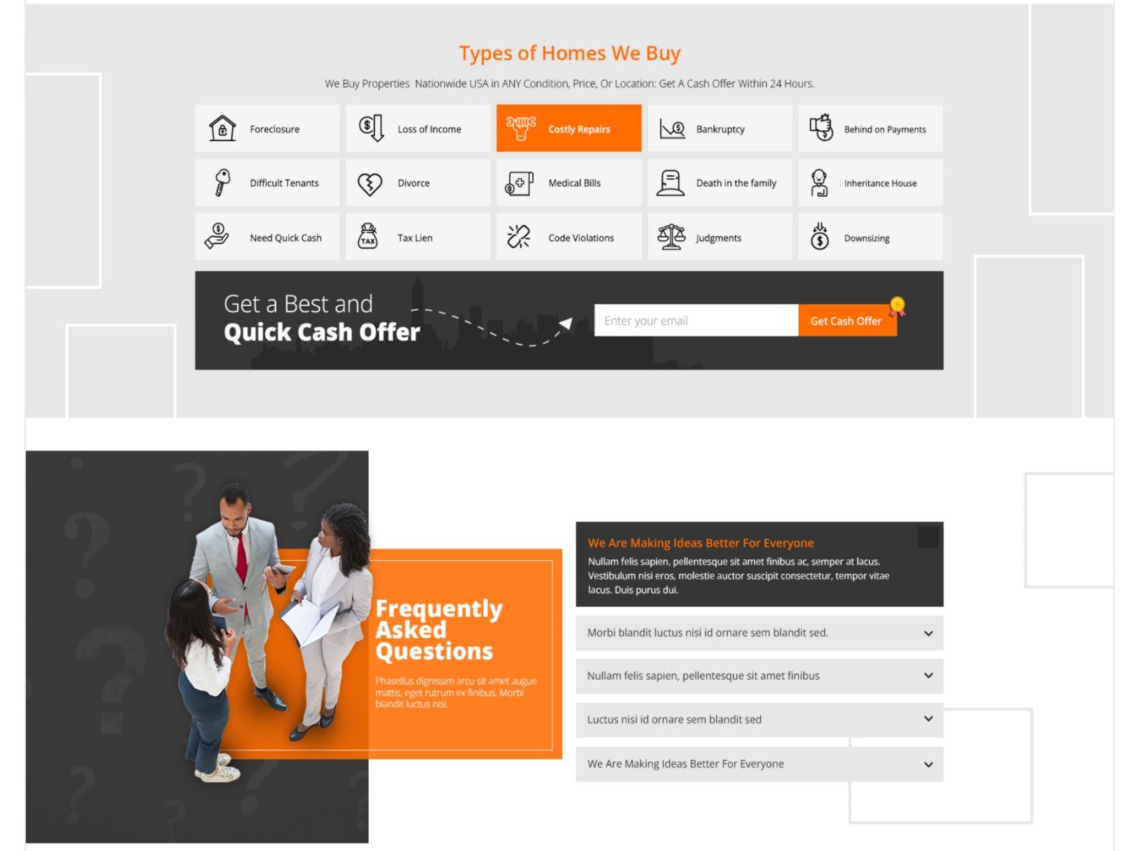
- Types of homes we buy: fifteen situations, from foreclosure and tax liens to inherited houses and difficult tenants.
- Quick cash offer band: a single email field to restart the conversion.
- FAQ: an accordion that handles objections without clutter.
- Testimonials and footer: social proof, then clear navigation for sellers, buyers, investors and agents.
Key design decisions.
A form in the hero, not behind a button
Name, email and property address sit right on the hero image, so starting takes seconds and the visitor never has to hunt for the next step.
The process as an appointment, in three steps
Selling a home sounds complex, so the flow is reduced to three numbered steps that start with booking an appointment. A friendly illustration of a thinking homeowner sets a human tone next to the steps.
Recognise yourself in the list
The "Types of Homes We Buy" grid lets owners spot their own situation at a glance, with clear icons and short labels, followed by a quick cash offer band and an FAQ that answers doubts in place.
Proof before the footer
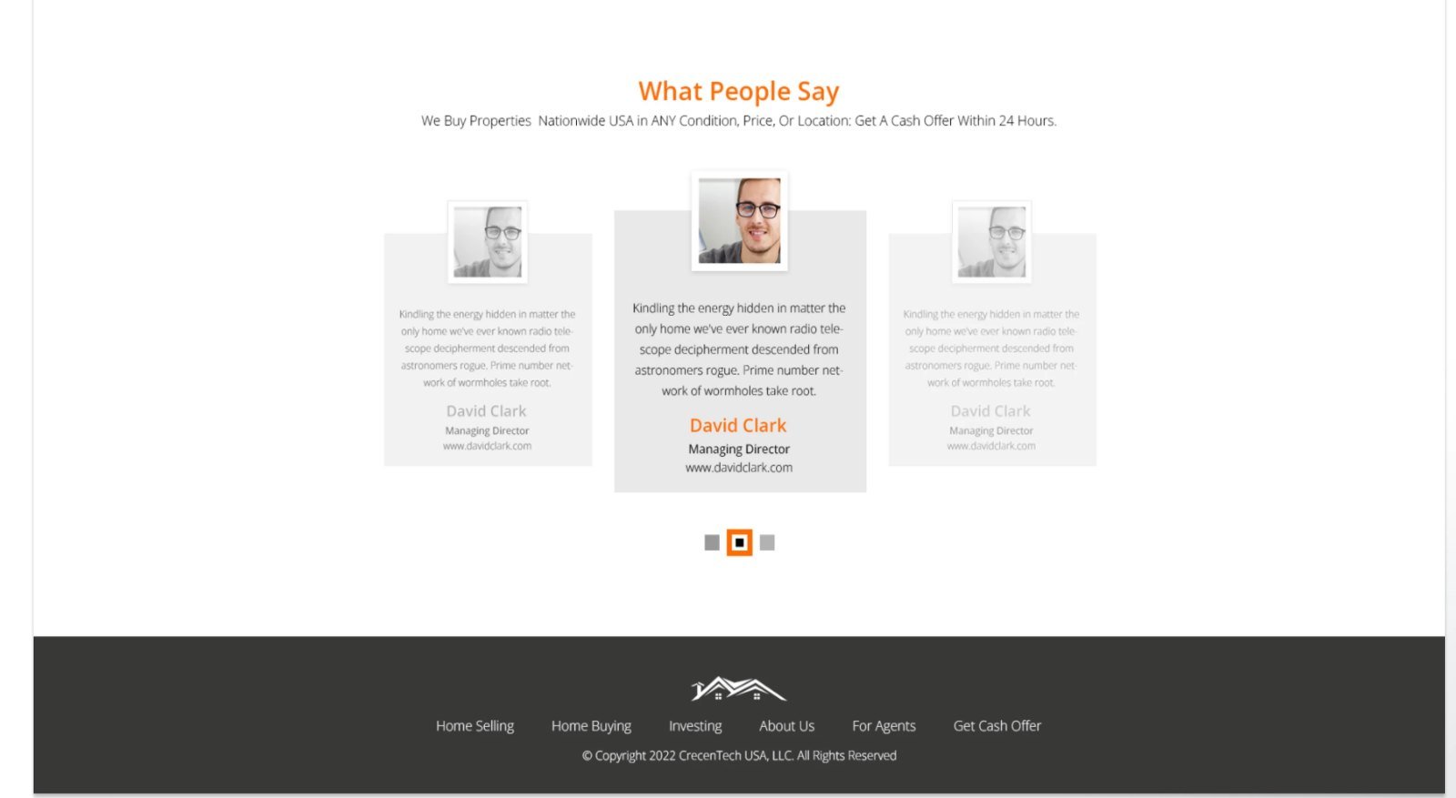
Testimonials in a simple carousel close the page with reassurance from other sellers before the final navigation.
Visual design and style guide.
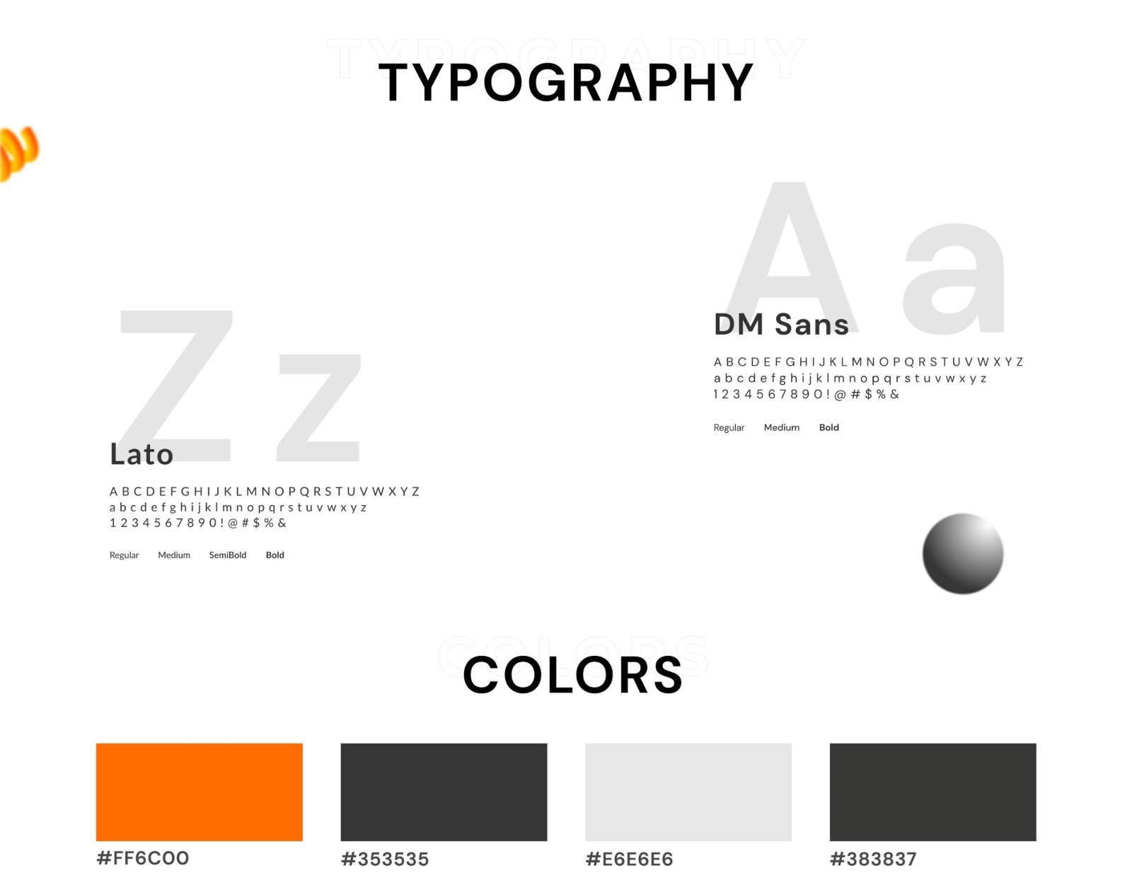
A confident orange accent (#FF6C00) on deep charcoal (#353535, #383837) and light grey (#E6E6E6) gives the page energy and urgency while keeping it serious and trustworthy. DM Sans handles headings and Lato keeps body copy readable. Orange is reserved for actions and key words, so the eye always lands on the next step.
Final landing page.
The complete page, from promise to proof, with a way to request an appointment or cash offer never more than a scroll away.
Outcomes and learnings.
The design turns a stressful, unfamiliar sale into a clear, guided path: a simple promise, an easy first step and steady reassurance along the way.
Design outcomes
- A clear value proposition and lead form above the fold.
- A three-step appointment flow that makes the process easy to understand.
- Repeated, well-placed calls to action without feeling pushy.
- Trust built through people, benefits, FAQs and testimonials.
Learnings
- When people are under pressure, fewer decisions beat more options.
- Showing what happens next is as persuasive as any headline.
- Letting users recognise their own situation builds trust fast.